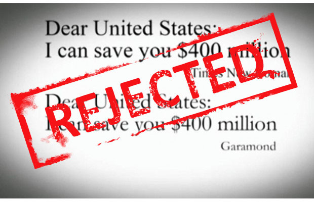
A few years ago, an enterprising 14-year old named Suvir Mirchandani came up with a revolutionary idea to save the government upwards of $370 million per year. Looking at the amount of printing his school district did during the course of a semester, he suggested they print all documents using Garamond as the standard font rather than Times New Roman. Because of its shape and size, Garamond would use less ink per letter according to his theory, which multiplied many times over on thousands and thousands of documents would add up to big savings over time.
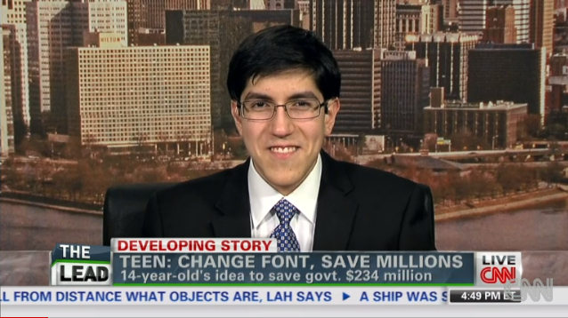
Soon enough, the Internet grabbed hold of his story, touting this genius plan from a boy wonder of fontsmanship as a marvel in cutting wasteful spending. Imagine what we could do with even an extra hundred million dollars at our disposal! Soon enough though, along came font aficionado and M.S. in printing Thomas Phinney to put the kibosh on his theory. In a post discussing both large-scale print methods used by the feds—lithographs produced on an offset press rather than a standard office printer or risograph, in case you’re wondering—and the actual readability of 12 point Garamond in practice, he established that it would not, in fact, save that much for taxpayers. Boo.
You are not printing like they are in Washington though, and in reality the way that you print for your small business or home use can save you a pretty chunk of change in the long term. When it comes to home printing, the fact of the matter is that some fonts just require more ink than others, and subsequently can put a drain on your ink and toner. But where do you start?
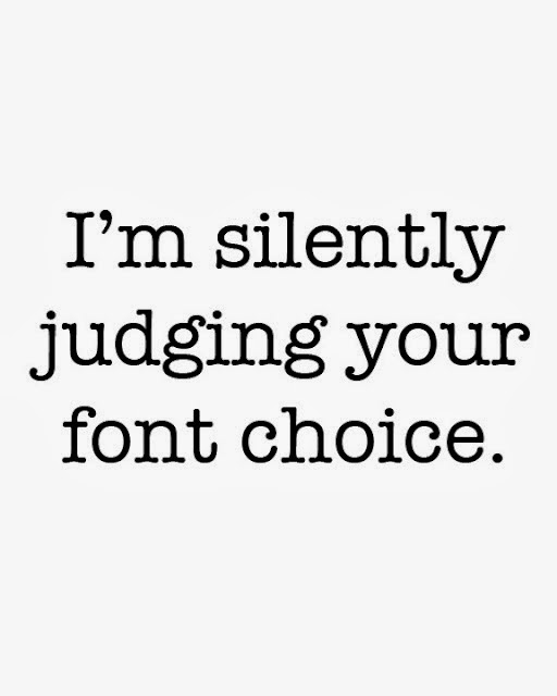
Fonts are something you may not think about a whole lot in your day to day existence, but in design they are incredibly important to the effectiveness of your final product. Different fonts can affect the way that you read something on the page, as well as your experience with the text you’re reading—so much so that it’s often common practice to use Garamond or similar literary-feeling fonts when submitting manuscripts to publishers, in the hopes that it helps them visualize your text on the page of a book. For people who study and appreciate typeface as an art, there are some choices that represent a cultural position and sophistication—and some that are almost universally reviled by experts and fairweather fans alike. It’s no wonder that many book publishers will include a brief note on the typeset they selected, along with the story of its creation and historic significance.
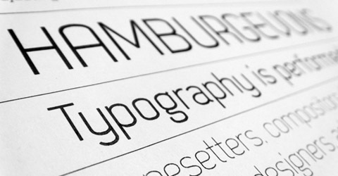
Certain fonts are more pleasing to the eye, whereas others distract from the text. Typography choices can influence reader speed and comprehension, make it easier to focus, or give a certain je ne sais quois to your signage. Fonts are fairly fascinating, to be frank. And research shows some of them are more cost effective than others. But which ones are the most cost efficient . . . and which ones will end up using up your ink the fastest?
Back in 2010, the folks at Printer.com took on this question and found some answers. Using two popular printers—Canon PIXMA MP 210 and Brother HL-2140—to simulate both home and office laser printing use, they used an assortment of ten commonly used fonts sized either 10 or 11 to track results over time. They used software to establish how much coverage each font required, and adjusted size to establish a control on paper use. What they found was pretty shocking:
The difference between choosing the most ink-friendly font and the worst in the study came to more than $27 for home printers over the course of a year. For businesses, the cost savings amounted to more than a hundred dollars a year.
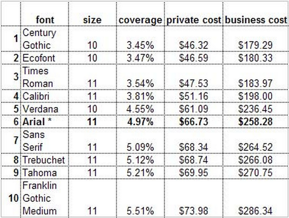
Even subtle changes from Arial, a popular choice often set as the default for some word processors, to Century Gothic puts an extra $20 in the pocket of home printers and nearly eighty in your office budget, according to their findings. More readable and traditional than Century Gothic, second place choice Ecofont was actually designed to use less ink and help save money (and the environment as well). Over time, switching fonts can equal big savings for you and your business.

Source: Ecofont
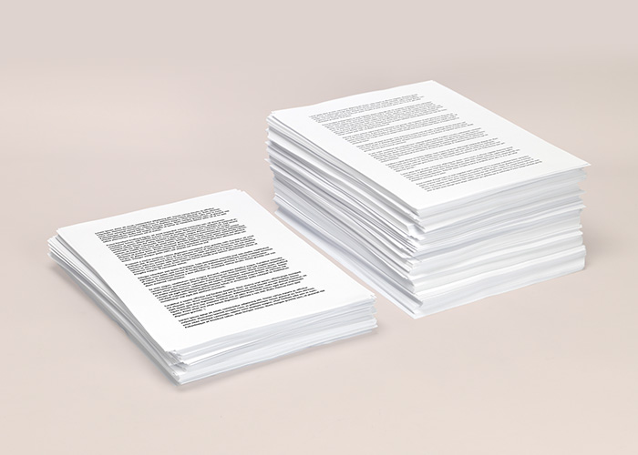
While the amount of ink you use is an important consideration when it comes to minimizing your office costs, it’s not the only thing you should think about when choosing a font. The amount of paper you use while printing affects your bottom line as much as anything else, especially for environmentally conscious people who choose recycled paper. Looking at a side-by-side comparison of fonts examined by Printer.com during their survey, it becomes apparent that some of the most ink-efficient fonts are not among the most paper friendly.
Of course, another factor to consider is readability. Eye strain can make some fonts more difficult to read over time. Finding the middle ground between very efficient and pleasing to the eye can be tough, but keeping track of your ink and paper savings can help in a big way. Once you decide on your perfect font, printing in draft mode can reduce the amount of ink you use, and when printing things for home use consider flipping used pages over and reusing them by printing on the other side, cutting down on both paper costs and the amount of printout paper you end up recycling at the end of the day.
Unfortunately, one thing didn’t get examined during this study: the financial impact of switching to Garamond, a la Suvir’s money saving suggestion! Do your own experimenting, and in time you will find the right combination that perfectly suits your needs (and saves you money on ink!)