
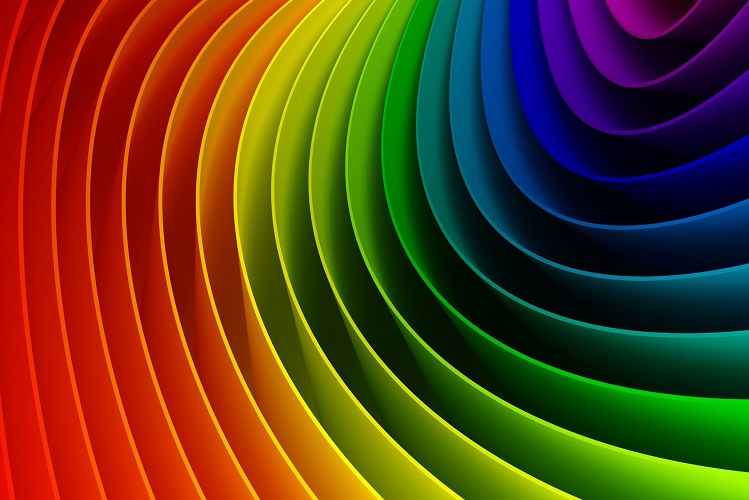
Choosing the right colors for your logo or presentation comes down to more than just pleasing the eye . . . your selections are active in triggering the mind as well. The colors you use strongly affect the viewer and can influence how they feel about your creation. Impressionist painter Claude Monet once wrote “color is my daylong obsession, joy, and torment.” And while you may not feel so strongly about colors as Claude did, we humans react to them on a deep psychological level thanks to our evolutionary upbringing. Even different shades of the same color can inspire comfort, confidence, unease, or promote action. In that sense, your unconscious brain is a little more like Monet than you’d ever imagined.
More than just picking a favorite color, looking at one color or another can actually physically affect your mood and how your body operates. First proposed by pioneering psychotherapist Carl Jung, the first principles of Color Psychology have blossomed into a full and intriguing research field over the course of the past several decades, used in therapy and marketing alike and inspiring to a wealth of studies . . . often with impressive and stark results.
When designing something to introduce a concept or product to your intended viewer, it’s crucial to understand that the way you present colors on the page can influence your intended audience in ways you may or may not anticipate.
For example, research on the color blue suggests that it can increase efficiency while lowering pulse and body temperature, which are tell tale indications of a relaxed mind. Different colored overlays on pages of text are believed by many researchers to improve reading speed and information intake, especially for people with learning disabilities. And studies have shown that different color shades can inspire relaxation and creativity, whereas bolder tones of the same color provoke discomfort and even aggression in test subjects. Similarly, softer tones put people in a laid back mindset, which in some small way explains the color pallette of every beach cottage I’ve ever visited.
Color Psychology in Print Design
When you’re printing something special that needs to make an impact, it’s important to take the psychology of color into consideration alongside other more obvious design elements like font and logo. What is the objective of your project and how can color help put that goal at the forefront of your design? Picking the right actionable color can lead to better results than a different color which viewers may see as off putting. Especially for Millennials, for whom technology has injected design into their lives from an early age, getting colors right is often as important as having a straightforward and attractive message.
Design by Friedlaender & Vranovský
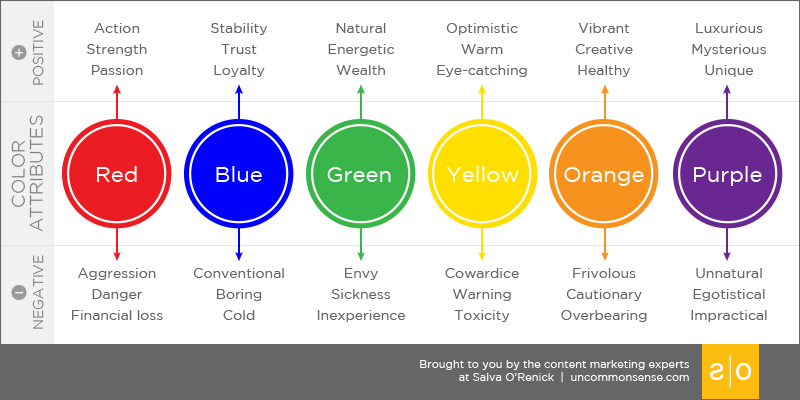
Color specialist Leatrice Eiseman is among the most renowned experts in pairing color to behavior. Using research combining the experiences of thousands of test subjects, she came to the conclusion that our interaction with colors mirrors how we associate them with natural events. From this information, she and other color theorists have made some conclusions about what types of tones work for specific objectives (and which ones run counter to the designer’s goals).
To help you along in your color search, here’s some tidbits from what her collected research and the findings of several other experts in the field say about different colors:
Red.
Printing up the new dinner specials menu for your cafe? Studies have found that red is the color that can inspire people to feel hungry. Really! Red is an emotionally rich color and spending time in its presence can raise your blood pressure and sharpen your senses. In western cultures, red is widely associated with romance . . . and I can’t help but wonder if getting the heart pumping has something to do with it. Choose red wisely though, as too much of a strong red is associated with provoking aggression and anxiety in clinical tests.
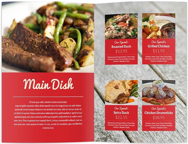
Download this menu template from IndieStock.me
Blue.
Looking to exude confidence and professionalism? Blue is commonly associated with both comfort and strength, and studies suggest that it boosts mental clarity and productivity (hence its popularity as a paint color for office walls). Similarly, blue suits are popular in part because they are traditional, but also because darker hues are associated with a powerful presence.

Yellow.
One of the colors most apparent in the visible light spectrum of the sun, yellow is invigorating to the mind (and when used too liberally stressful to the eye). Research suggests that yellow can even increase your metabolism. If you’re looking to get someone excited about a presentation, choosing yellow can draw attention to important features of your pitch, but be wary as too much yellow can cause eye strain and fatigue the viewer.
Design by Plimsoll Line
Green.
Green has the unique ability to inspire a wide range of feelings. Our mind associates green with the natural world and it can make us feel healthier—and because of its connection to the dollar bill, wealthier. Physically, exposure to green causes less eye strain over the long term than other colors, and can be stimulative without becoming overbearing. Green is recommended is a great color for your desktop because of just this reason.
Design by KIAN
Orange.
Tone is important for orange. Bright citrus fruits—such as, for example, oranges—evolved that color to attract attention of birds and other animals who eat the fruit and help spread seeds. This instinctive impulse works for humans too, and the attention grabbing properties of orange are why it’s popular for safety vests and construction signs. Orange fosters excitement, enthusiasm, and even comfort when used in soft-to-moderate tones. It’s also closely tied with seasonal change, thanks to the prominent role orange tones play in the symphony of autumn leaves.

Design by Alphabet Arm
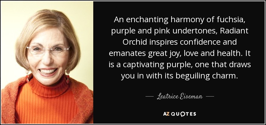
Purple.
The violet end of the ROYGBIV spectrum occurs much less frequently in natural world than other colors. As a result, purple has a legacy in the mind as an exotic and eye grabbing color—and one more culturally aligned than instinctive. Purple is tied to royalty and wealth from as early as Homer and the Virgil, and it is widely believed that ancient leaders from Egyptian pharaohs to Alexander the Great adorned themselves in purple robes to represent their power and divinity. Choosing purple in your printing isn’t as loud as a red or orange, but it teases the eye thanks in part to its rich sophisticated tone and uniqueness.
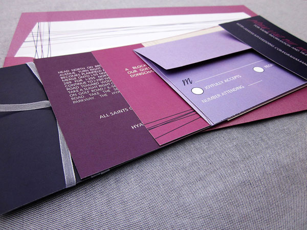
Wedding Invites by Julie Hanan Design
All of this goes to show the importance of printing colors precisely to curate a desired effect. With important projects, knowing which ink and paper combinations will produce the type of results you want can make all the difference. Recreating tones the way they should look comes down to combining the right knowledge and with the right tools. Here are some other resources to help you hammer down the right colors for your next print design project:
Colour Pallete Software from ColourLovers.com
Download Color Matching Applications from ColorSchemer.com
Disclaimer: The images on this page are not owned by InkCartridges.com and are used solely as examples or to illustrate concepts discussed in the article. Please click on the images to see their original sources.

[…] smartly. Color is as important to direct mail as it is for the web. Color influences the way people unconsciously interact with advertising. You can also use familiar cues people have learned for sorting mail to your advantage For example: […]